
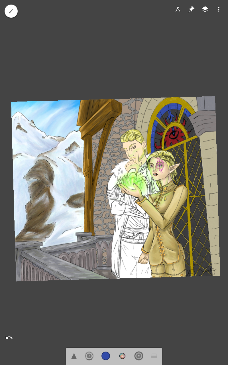
So recently I have been working on my inquisitor piece. I haven’t really thought to post it as it was slow working, and one change here and there some people may not even notice…. I have been trying to not be as much of a perfectionist on the coloring… I have found over the years I like it when the artist leaves an illusion of detail. If you look up some of the original Guild Wars 2 concept art you will see what I am kind of talking about. Now I am not saying I want this to become my style… I would like it to work its way into my style and improve my artwork. That way I can put in as much detail as I want without being so annoyed with how it looks… Not sure if that makes any sense.
On another note, my husband and I finished painting the hallway and put up the art work… It is such a funny thing 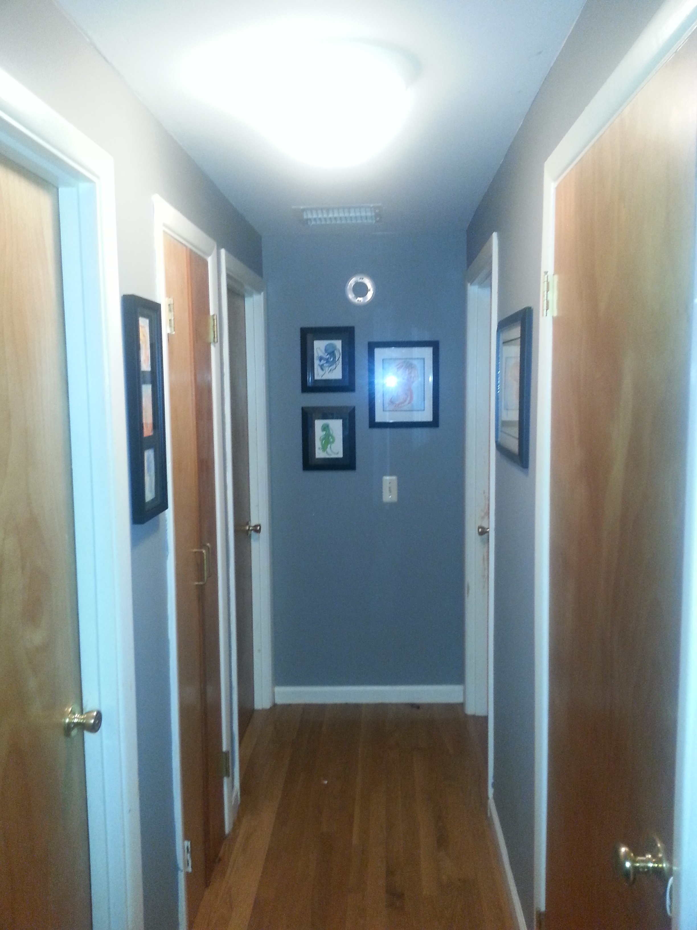 how colors work in different areas next to different colors. I know and understand why, but I feel like it will one of those things that will never cease to amaze me. I say this because I had wanted grey. As in true grey… Now unless I printed off a swatch of 50 percent black on my computer I simply would not get that. Also who knows how that would really look on a wall other than the professionals. So i stead of being smart about it we went and chose a fleece grey and put the sample on the wall. It looked periwinkle… So I figured well maybe it is because or the orange walls, so I used the entire sample to cover a majority of our small hallway. NOPE…Definitely blue… So we went back out and bought a yellow grey. Mind you this grey was definatly a yellow grey. Painted that up and it looks just like the fleece grey did just a hair darker. I like it, however it is just one of those things.
I believe that is all I have to update on for now!
Until next time, safe travels and good luck on all your endeavors,
-The Sonne Faun
